Wiki Components
WARNING
Contributing to the wiki is currently limited to Alderon Games staff and selected community members. If you are interested in contributing, please create a github account and wait for further instructions.
This page demonstrates some of the built-in markdown extensions provided by VitePress that you can use while editing the markdown files. It also includes some custom components that are not present by default in VitePress.
INFO
Please make sure to follow the Contributing Guidelines if you want to contribute to the wiki.
Built-in Markdown Extensions
The following are some of the built-in markdown extensions provided by VitePress:
Syntax Highlighting
VitePress provides Syntax Highlighting powered by Shiki, with additional features like line-highlighting:
Input
```js{4}
export default {
  data () {
    return {
      msg: 'Highlighted!'
    }
  }
}
```
Output
export default {
  data () {
    return {
      msg: 'Highlighted!'
    }
  }
}
Containers
VitePress provides containers that allow you to create blocks with different styles. The following are the available containers which allow you to create different types of blocks and highlight important information:
Input
::: info
This is an info box.
:::

::: tip
This is a tip.
:::

::: warning
This is a warning.
:::

::: danger
This is a dangerous warning.
:::

::: details
This is a details block.
:::

::: tabs
== Tab 1
- Information on the first tab
- This is a custom component, not present by default in VitePress
== Tab 2
- Information on the second tab
:::
Output
INFO
This is an info box.
TIP
This is a tip.
WARNING
This is a warning.
DANGER
This is a dangerous warning.
Details
This is a details block.
- Information on the first tab
- This is a custom component, not present by default in VitePress
More Markdown
Check out the documentation for the full list of markdown extensions.
Custom Components
The following are the custom components that can be used in markdown files:
TableAccordion
Table accordion is a custom component that allows you to create a "table" with collapsible rows. This is useful for displaying large amounts of data without taking up too much space.
It is a custom HTML element that can be included in the markdown files:
Input
<TableAccordion :rows="[
  {
    label: 'row1',
    description: 'Row 1 description.',
    details: {
      'det1': 'Example detail 1',
      'det2': 'Example detail 2'
    }
  },
  {
    label: 'row2',
    description: 'Row 2 description.',
    details: {
      'det3': 'Example detail 3',
      'det4': 'Example detail 4'
    }
  }
]"/>
Output
Archived Banner
The archived banner is a custom component that can be used to display a banner indicating that the content is archived. This is useful for marking outdated content that should not be used anymore but is kept for reference.
It is a custom HTML element that can be included in the markdown files:
Input
<ArchivedBanner/>Output
Breadcrumbs
The breadcrumbs component is a custom component that can be used to display a breadcrumb trail for navigation. This is useful for showing the hierarchy of pages and helping users navigate through the wiki.
It is a custom HTML element that can be included in the markdown files:
Input
<Breadcrumbs :path="[
  { name: 'PathOfTitans', icon: 'fas fa-folder' },
  { name: 'Saved', icon: 'fas fa-folder' },
  { name: 'test.txt', icon: 'fas fa-file' },
]" />
Output
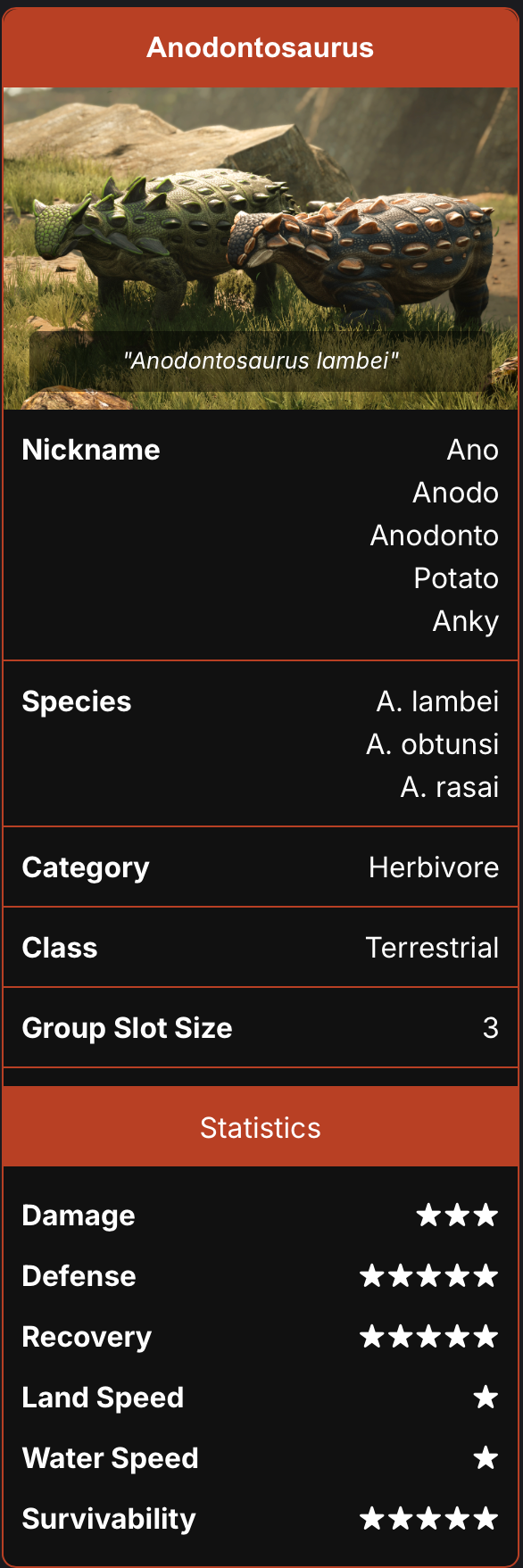
Dinosaur Card
The dinosaur card is a custom component that can be used to display information about a dinosaur. This is useful for showing detailed information about a dinosaur, such as its name, species, and description.
WARNING
If you are using images, make sure to include the correct path to the image in the front matter of the markdown file.
To create a dinosaur card, you have to add some data to the beginning of the markdown file (front matter) and then include the custom component in the markdown file:
Input
---
dino_data:
  title: Anodontosaurus
  species: A. lambei<br>A. obtunsi<br>A. rasai
  nickname: Ano<br>Anodo<br>Anodonto<br>Potato<br>Anky
  image: ../imgs/AnodontoPairHeader.png
  caption: Anodontosaurus lambei
  category: Herbivore
  dinosaurClass: Terrestrial
  groupSlotSize: 3
  statistics:
  - label: Damage
    value: ★★★
  - label: Defense
    value: ★★★★★
  - label: Recovery
    value: ★★★★★
  - label: Land Speed
    value: ★
  - label: Water Speed
    value: ★
  - label: Survivability
    value: ★★★★★
---
Output
The following is just an example of how the dinosaur card would look like. You can customize the content based on the data you provide in the front matter. The card will be shown at the top-right corner of the page.
Nesting Card
<NestCard
  :items="[
    {
      name: 'Mud',
      src: 'https://cdn.alderongames.wiki/server-wiki/master/T_Item_AntHill_UI.png'
    },
    {
      name: 'Reeds',
      src: 'https://cdn.alderongames.wiki/server-wiki/master/T_Reeds_UI.png'
    },
    {
      name: 'Roots',
      src: 'https://cdn.alderongames.wiki/server-wiki/master/Roots.png'
    }
  ]"
/>
Output


Thumbnail Card
Similar to the dinosaur card, the thumbnail card is a custom component that can be used to display information about a thumbnail. This is useful for showing similar but simpler information with just image.
WARNING
If you are using images, make sure to include the correct path to the image in the front matter of the markdown file.
To create a thumbnail card, you have to add some data to the beginning of the markdown file (front matter) and then include the custom component in the markdown file:
Input
---
thumbnail_data:
  image: https://cdn.alderongames.wiki/server-wiki/master/Marksicon.png
  caption: Marks
  width: 120
---
Output
The following is just an example of how the thumbnail card would look like. You can customize the content based on the data you provide in the front matter. The card will be shown at the top-right corner of the page.

Gallery Grid
The gallery grid is a custom component that can be used to display a grid of images. This is useful for showing multiple images in a grid format.
To create a gallery grid, you have to include the custom component in the markdown file:
Input
<GalleryGrid :items="[
  {
    src: 'https://cdn.alderongames.wiki/server-wiki/master/banner.jpg',
    caption: 'Default',
    title: 'Default',
    price: 'FREE',
    price_icon: 'https://cdn.alderongames.wiki/server-wiki/master/Marksicon.png',
    rarity: 'Common',
  },
  {
    src: 'https://cdn.alderongames.wiki/server-wiki/master/banner.jpg',
    caption: 'Roadrunner',
    title: 'Roadrunner',
    price: '3,000',
    price_icon: 'https://cdn.alderongames.wiki/server-wiki/master/Marksicon.png',
    rarity: 'Common',
  },
  {
    src: 'https://cdn.alderongames.wiki/server-wiki/master/banner.jpg',
    caption: 'Masked',
    title: 'Masked',
    price: '3,500',
    price_icon: 'https://cdn.alderongames.wiki/server-wiki/master/Marksicon.png',
    rarity: 'Common',
  },
  {
    src: 'https://cdn.alderongames.wiki/server-wiki/master/banner.jpg',
    caption: 'Trogon',
    title: 'Trogon',
    price: '5,000',
    price_icon: 'https://cdn.alderongames.wiki/server-wiki/master/Marksicon.png',
    rarity: 'Uncommon',
  },
  {
    src: 'https://cdn.alderongames.wiki/server-wiki/master/banner.jpg',
    caption: 'Vulture',
    title: 'Vulture',
    price: '8,000',
    price_icon: 'https://cdn.alderongames.wiki/server-wiki/master/Marksicon.png',
    rarity: 'Rare',
  },
  {
    src: 'https://cdn.alderongames.wiki/server-wiki/master/banner.jpg',
    caption: 'Melanistic',
    title: 'Melanistic',
    price: '10,000',
    price_icon: 'https://cdn.alderongames.wiki/server-wiki/master/Marksicon.png',
    rarity: 'Legendary',
  },
  {
    src: 'https://cdn.alderongames.wiki/server-wiki/master/banner.jpg',
    caption: 'Backer',
    title: 'Backer',
  }
]" />
Output
Here are some examples of how the gallery grid would look like with different items and data provided:
 FREE ) 3,000 ) 3,500 ) 5,000 ) 8,000 ) 10,000 )
 Video Player
The video player is a custom component that can be used to embed videos in the markdown files. This is useful for showing video tutorials or gameplay videos.
To create a video player, you have to include the custom component in the markdown file:
Input
<VideoPlayer src="https://www.youtube-nocookie.com/embed/PXaJJyVd3YM" />TIP
The link has to be the embed link of the YouTube video. You can get the embed link by clicking on the "Share" button on YouTube and selecting the "Embed" option.
If you know how to use the no-cookie version of YouTube, you can use the youtube-nocookie.com domain to embed the video.